In recent years, the landscape of housing affordability in the United States has undergone a pronounced transformation, witnessing not only significant disparities but also a recent surge in unaffordability that has extended beyond the traditional coastal hotspots. As cities along both the Atlantic and Pacific shores continue to grapple with skyrocketing real estate prices, this phenomenon has rapidly spread to encompass regions such as the Intermountain West, Southwest, and Southeastern states, where the cost of living was once considered more attainable. Driven by a confluence of economic forces, population shifts, and constrained housing supplies, these areas are now at the forefront of the nation’s affordability crisis. This article delves into the findings of a recent study I conducted that leveraged a mix of data from Zillow and the US Census Bureau to calculate a county-level housing affordability ratio.
What is the affordability ratio?
The affordability ratio calculates how affordable it is to live in an area by taking the median home value (ZHVI) and dividing it by the median income. In other words, if a home buyer was to use their full annual salary to pay off their mortgage, the ratio calculates how many years it would take to do so.
The Zillow Home Value Index (ZHVI) is not a simple mean or average calculation of home values. Instead, ZHVI represents a seasonally adjusted measure of the median estimated home value across a given region and housing type. By focusing on the median value, the ZHVI reduces the impact of outliers on the overall home value trend, providing a more accurate representation of the typical home value in the area. This approach ensures that the index reflects the middle point of the market, where half of all homes are valued above this point and half below, offering a reliable indicator of housing market trends over time.
The US Census Bureau American Community Survey table for median income was used in the analysis.
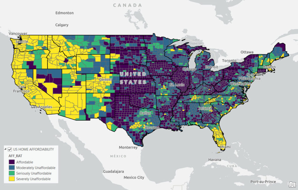
The two data sources were joined together at the county level using an R script and an affordability ratio was calculated. Finally, the data was mapped in ArcGIS Pro to produce the result you see below.
A ratio of 3.0 and under is generally considered affordable, 3.1 to 4.0 is considered moderately unaffordable, 4.1 to 5.0 is considered seriously unaffordable and 5.1 and over is considered severely unaffordable.
Mapping the Affordability Ratio
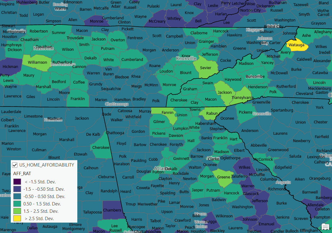
The map below tells a story of widely distributed areas in the United State that are either severely or seriously unaffordable as of 2022. As expected this includes the coastal regions of the United States which have traditionally been more unaffordable, but notice the large sections of the Intermountain West, Southwest, Texas, Tennessee, and western North Carolina that fall into these categories as well. As expected, the Midwest, Rust Belt, and portions of the Deep South are still “affordable”.

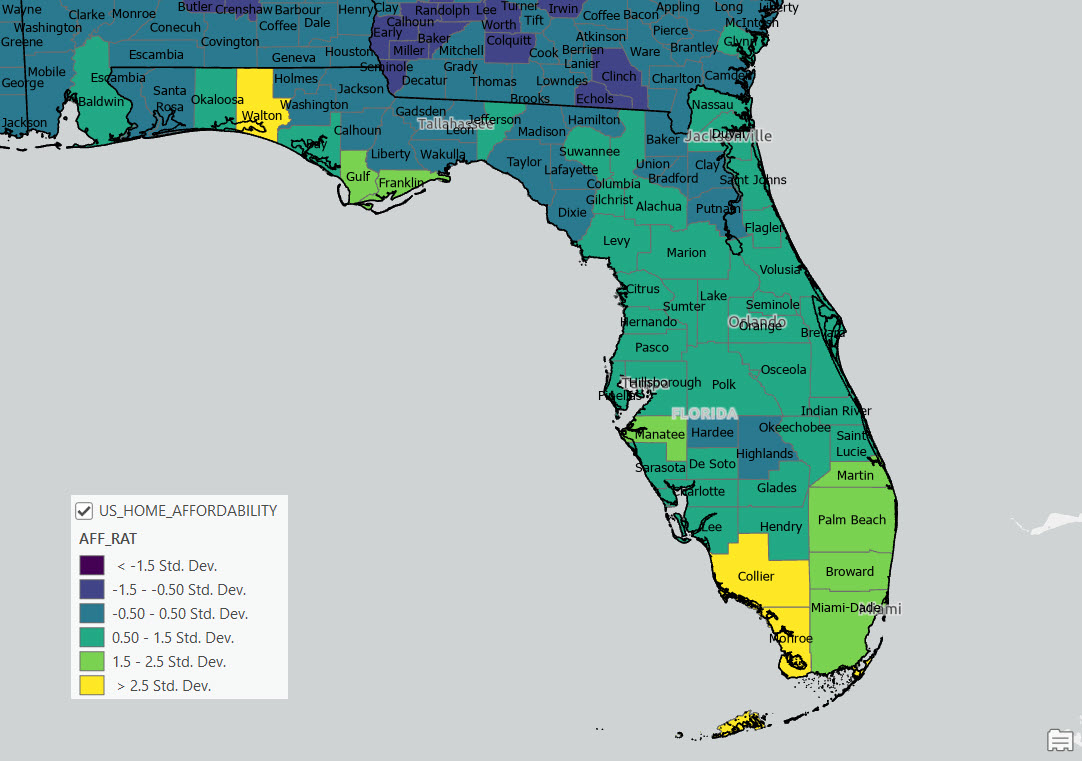
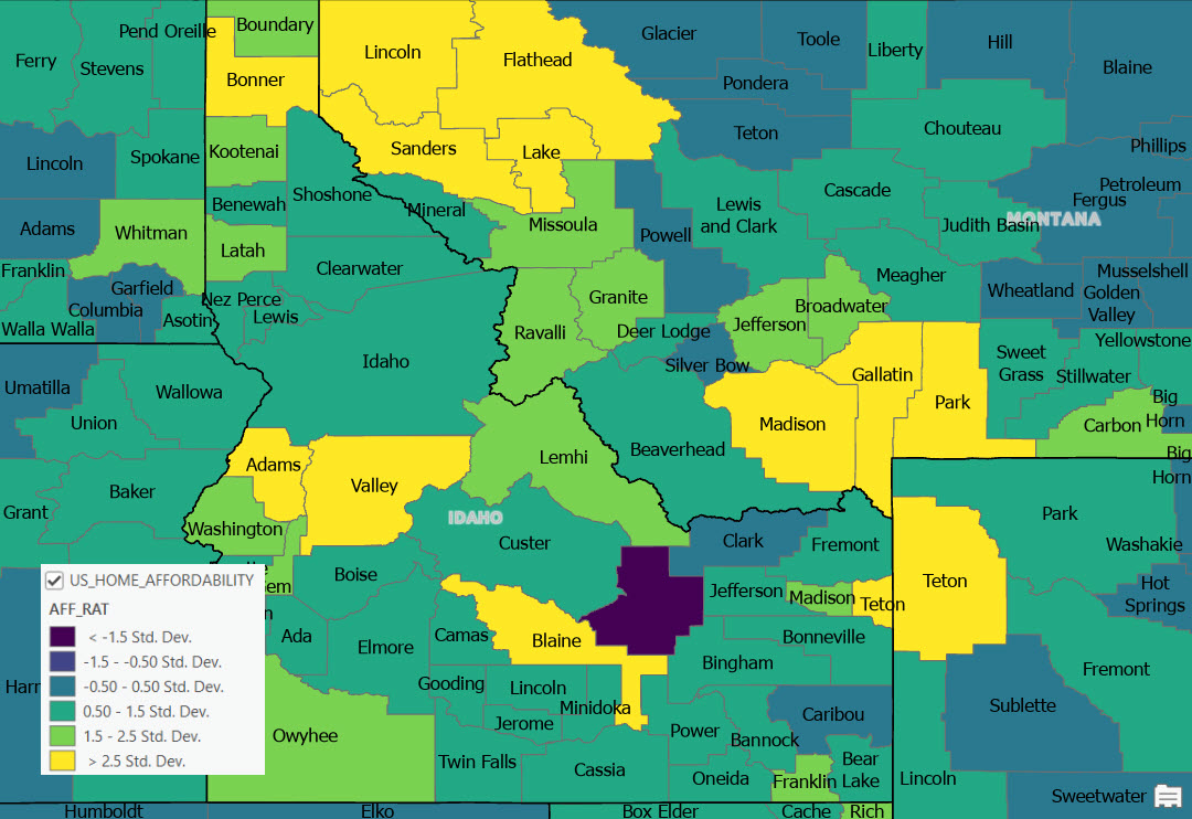
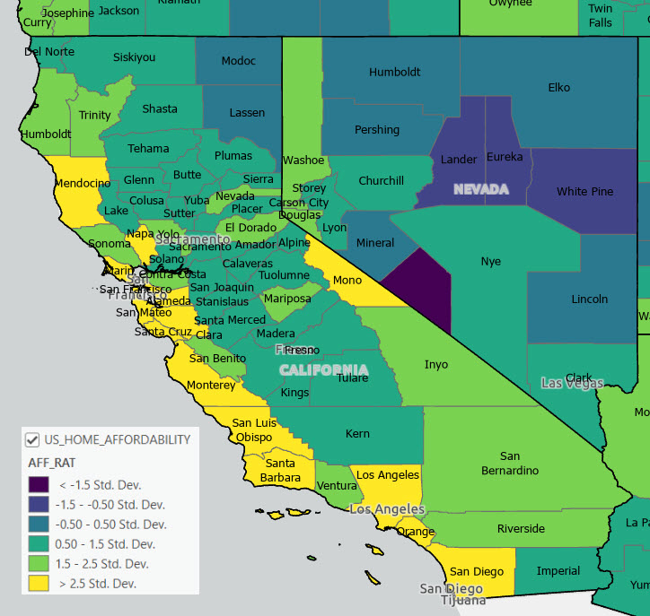
If the data is mapped by standard deviation we see even more distinct patterns in the data highlighting the extreme unaffordability of home values along the Pacific Coast with additional widespread hotspots in Colorado, Arizona, Utah, Montana, Idaho, and southern Florida. Many of these areas have affordability ratios above 1.5 standard deviations from the mean.
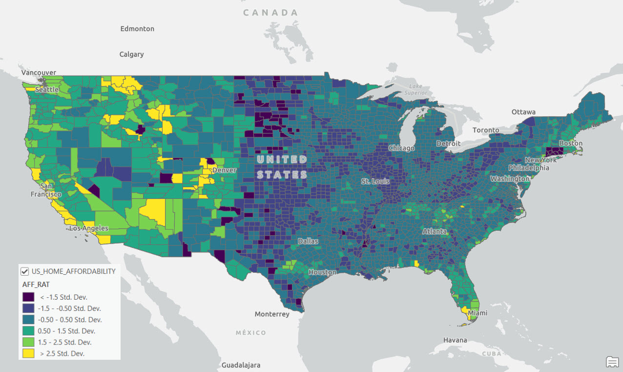
The top 10 most unaffordable counties in the United States according to our analysis include (primary city in parentheses) with ratio included):
- Pitkin County, CO (Aspen) – 47.50
- San Miguel County, CO (Telluride) – 27.45
- Teton County, WY (Jackson) – 21.91
- Nantucket County, MA (Nantucket) – 19.69
- New York County, NY (NYC) – 16.23
- Dukes County, MA (Marthas Vineyard) – 15.39
- Summit County, CO (Breckenridge) – 14.32
- Eagle County, CO (Vail) – 13.79
- Bronx County, NY (NYC) – 13.01
- Blaine County, ID (Sun Valley) – 12.98
Regional Patterns
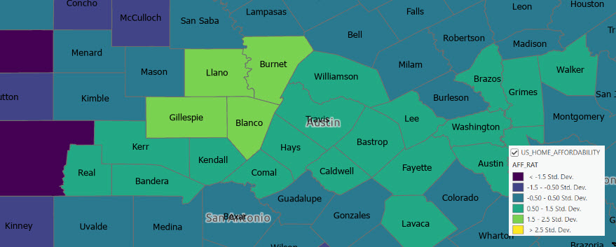
If we zoom in to specific regions of the country the patterns are more apparent.
Colorado

Idaho/Montana
California
Central Texas
