Ground Pulse
Where development is actually happening — measured, not modeled.
Ground Pulse maps physical development for 198 U.S. metros from satellite land-cover change and a 104-million-building footprint inventory. Every package is a complete GIS product: data layers, a ready-to-open ArcGIS Pro project, a branded PDF report, and full documentation. Published pricing, one-time purchase, no procurement dance.
New Development Mapping
Every patch of ground in the metro that converted from soft surface to hard surface — rooftops, pavement, concrete — extracted from USGS Annual NLCD satellite data and delivered as classified polygons for two contiguous 4-year periods (2017–2021 and 2021–2025). The periods share an endpoint, so they tile perfectly: every unit of development falls in exactly one period, which is what makes the period-over-period story statistically clean.
- Development polygons for both periods, classed by intensity (moderate / substantial / heavy gain)
- Clean 10-percentage-point gain threshold — noise and reprocessing drift filtered out
- Sub-2-pixel specks dropped automatically
- Area attributes in square meters on every polygon
- Equal-area projection (CONUS Albers) — acreage math is safe out of the box
When to use this: any question that starts with “where did growth actually go” — corridor studies, comp-plan evidence, market overviews, infrastructure timing.
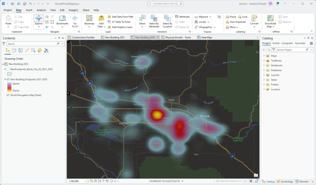
The Construction Frontier
The layer that doesn’t exist anywhere else at this price: land that converted in the current period but has no buildings on it yet. Graded subdivisions. Prepped commercial pads. The literal leading edge of development — visible 12–36 months before it becomes rooftops in closing data. Across the library the Frontier covers 1,700 square miles.
- Every current-period development polygon classified by building presence: FRONTIER (no buildings), ACTIVE (partly built), BUILT (built out)
- Building count, footprint area, and coverage percentage on every polygon
- Shape attributes (bounding-box fill) to separate subdivisions from linear features like roads
- Point version included for density and heat-map rendering
Limitations (we print these in the product too): a FRONTIER polygon can also be new roads, parking, or utility-scale surfaces — the attributes help you tell which, and high-stakes sites should be verified against recent imagery.
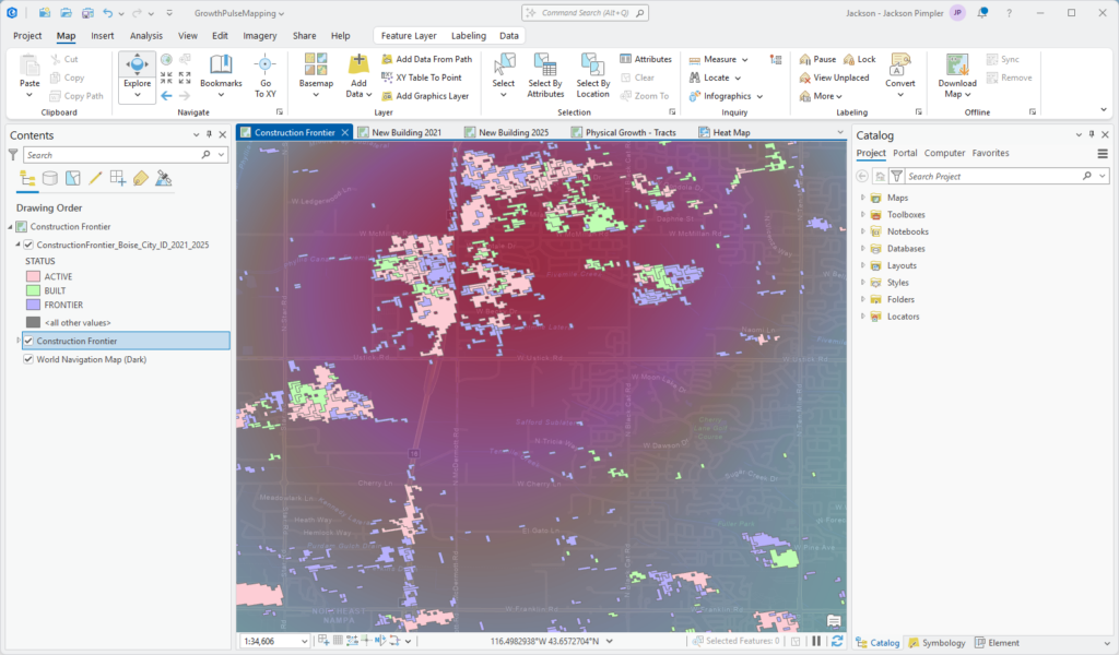
New Construction Buildings
Individual building footprints flagged as new construction — 458,000+ nationwide in the current period. Not because a database record said so: because the ground under them measurably changed.
- Full footprint geometry with the development class it stands on
- Source and vintage attributes (OpenStreetMap / Microsoft) for provenance
- Height and floor counts where the source provides them
- Per-period layers: see the 2017–2021 wave and the 2021–2025 wave separately
- Centroid point layers included for heat maps and density surfaces
Why this matters: footprint databases carry edit dates, not construction dates — a mass data import can make an entire metro look “new.” Ground Pulse anchors every new-construction claim to observed land-cover change instead.
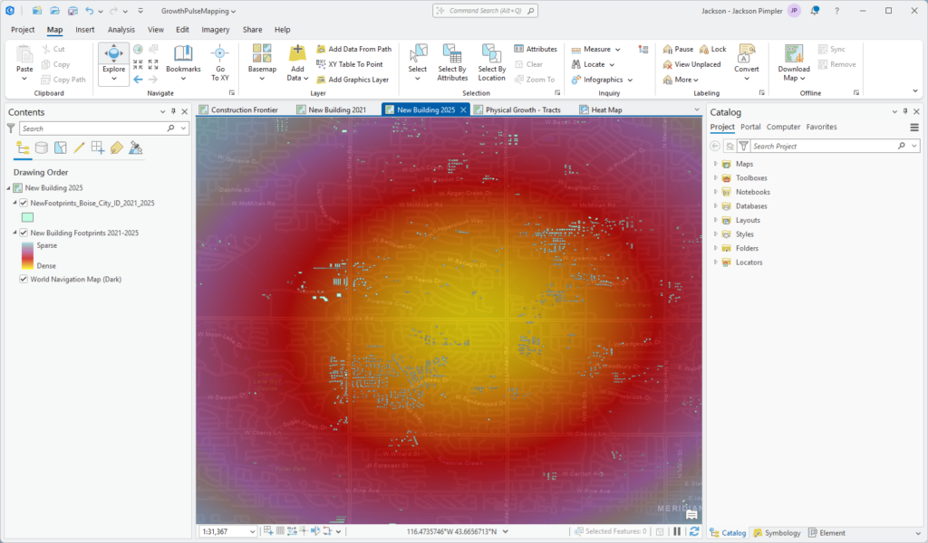
Complete Building Inventory
The full Overture Maps building stock for the metro — every structure, not just the new ones — so your analysis has the denominator, not just the numerator.
- 104 million buildings across the library; 265,000–7,000,000 per metro
- Class and subtype attributes (residential, commercial, industrial…) where available
- Height and floor counts for urban-form analysis
- Pinned to a documented Overture release for reproducibility
- Mega-metros ship as GeoPackage to break the shapefile 2 GB ceiling
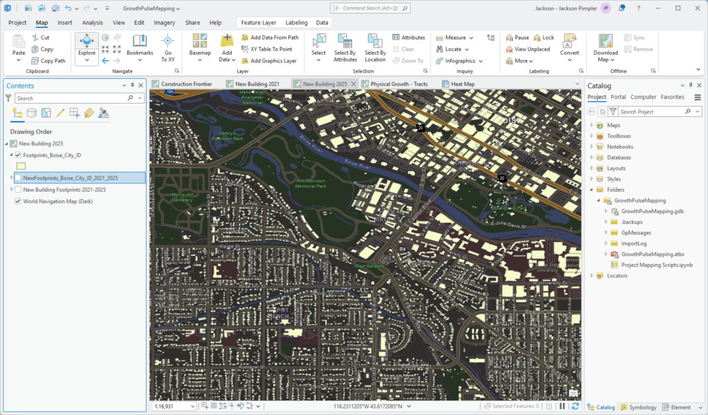
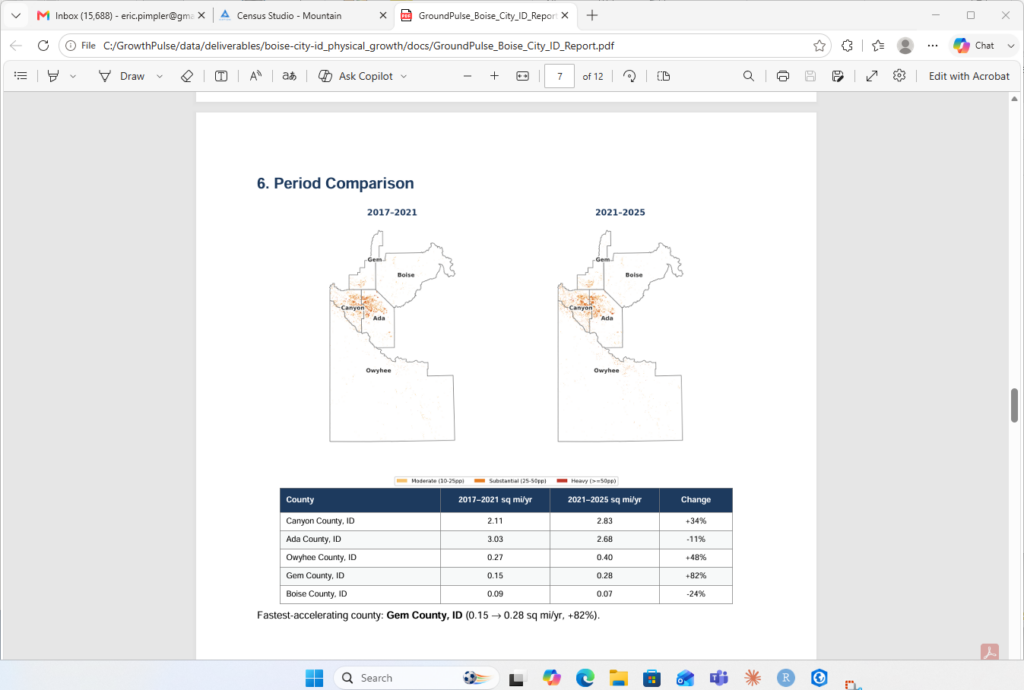
Period over Period Acceleration
Two identically-measured windows mean you can say more than “this metro is growing” — you can say where it’s speeding up and where it’s cooling, county by county, corridor by corridor.
- Side-by-side development maps for both periods in the report
- County acceleration table: square miles per year, percent change
- The narrative finding in plain language — where the boom front moved
- The Boise example: Canyon County overtook Ada County in the current period while the metro total rose — the boom didn’t slow, it moved 20 miles west
Census Tract Rollup
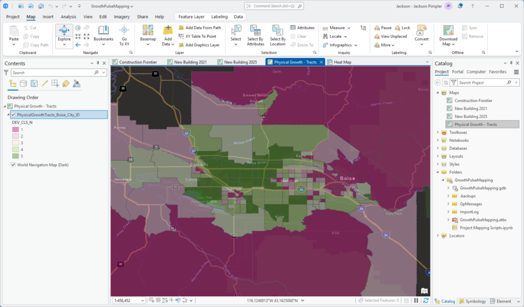
Everything above, rolled up to 2020 census tracts — the join-ready summary layer that connects Ground Pulse to every demographic dataset you already use (including Growth Pulse and anything from Census Studio).
- Development acres per tract, per period
- New-building counts per tract, per period
- Construction Frontier acres and percent of tract land
- Development-intensity quintiles, raw and tract-size-normalized
- Standard GEOID join key — one join connects it to ACS, Growth Pulse forecasts, or your own data
When to use this: screening (“rank tracts by frontier share”), demographic overlays (“new development vs. school-age population”), or any workflow that lives at tract level.
Development Hot Spot Heat Maps
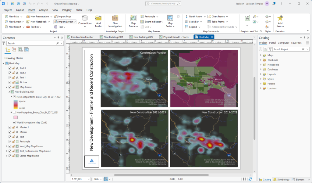
Authored heat-map symbology that turns half a million points into an instantly readable picture of where construction concentrates — the same graphic that anchors the PDF report.
- Kernel-density heat maps of new construction for both periods
- Construction Frontier heat map — the “what’s coming” panel
- Four-panel print layout combining the heat maps with the tract intensity choropleth
- Ships pre-authored in the ArcGIS Pro project; export or restyle freely
Ready-to-Open ArcGIS Pro Project
No assembly. Each package includes a complete ArcGIS Pro project with four preconfigured maps and the print layout, every layer already symbolized and pointed at the package’s data.
- Four maps: Construction Frontier, New Building 2021, New Building 2025, and the tract intensity map
- Print-ready “Heat Map” layout at metro extent
- File geodatabase copy of every layer with full-length field names and aliases (no cryptic shapefile abbreviations)
- Works in ArcGIS Pro 3.0+; all layers also load directly in QGIS or any modern GIS
Branded PDF Report & Documentation
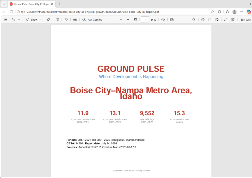
For every audience that doesn’t open a GIS: a ~12-page report that reads the metro’s development story in plain language, plus the documentation layer that makes the data defensible in front of a council, a board, or a procurement office.
- Cover stats: new development per period, new buildings, frontier area
- County tables, comparison spread, frontier analysis, county detail maps
- Methodology and caveats printed in full — honest by design
- FGDC metadata on every dataset (ArcGIS and QGIS read it automatically)
- “How to Use This Product” guide and machine-readable package index
Data sources: USGS Annual NLCD (public domain). Building data © Overture Maps Foundation, © OpenStreetMap contributors, Microsoft. ODbL.